04 / Surface & depth
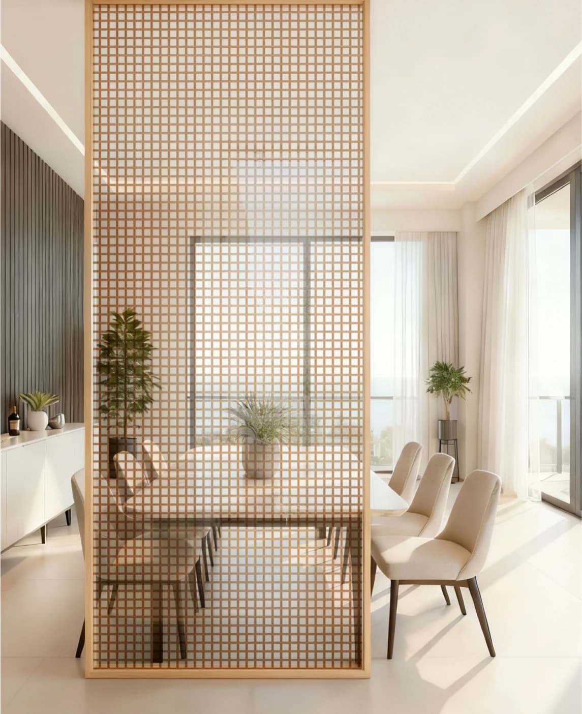
Texture.
A surface that holds the light.
 Start a Project
01 / Colour & atmosphere
An atmosphere in every shade.
Colour is a relationship between a surface, its light and the space around it. Explore four material perspectives, then develop a direction around your application.
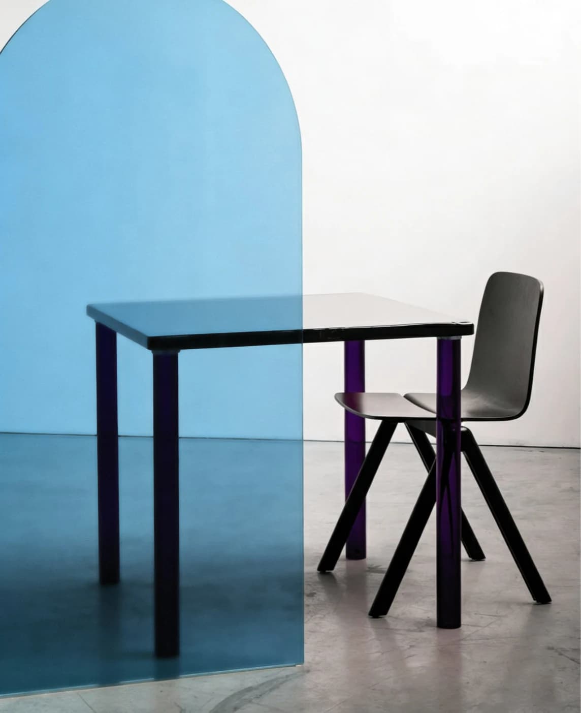
01 / Atmosphere
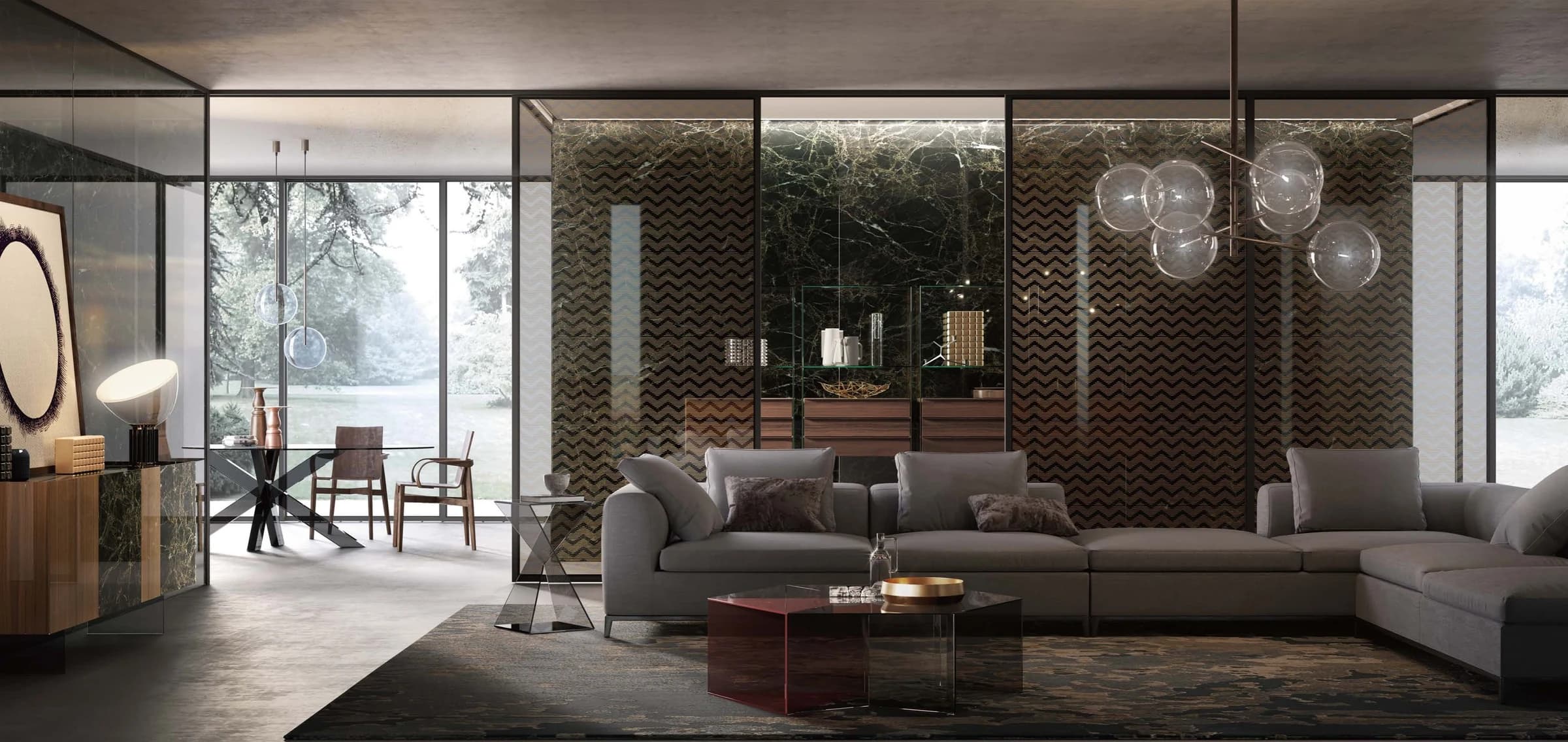
Colour begins a conversation before a room is occupied. A cool blue can sit quietly beside a dark chair; an amber surface can bring a warmer note to a pale interior. The interest lies in the relationship, not in the colour alone. Consider the neighbouring wall, the floor beneath it and the objects seen through the glass. A small sample is a useful beginning. Placed within the wider palette, it becomes a way to explore emphasis, continuity and the mood of a space.
POBO collection archive / Four material perspectives
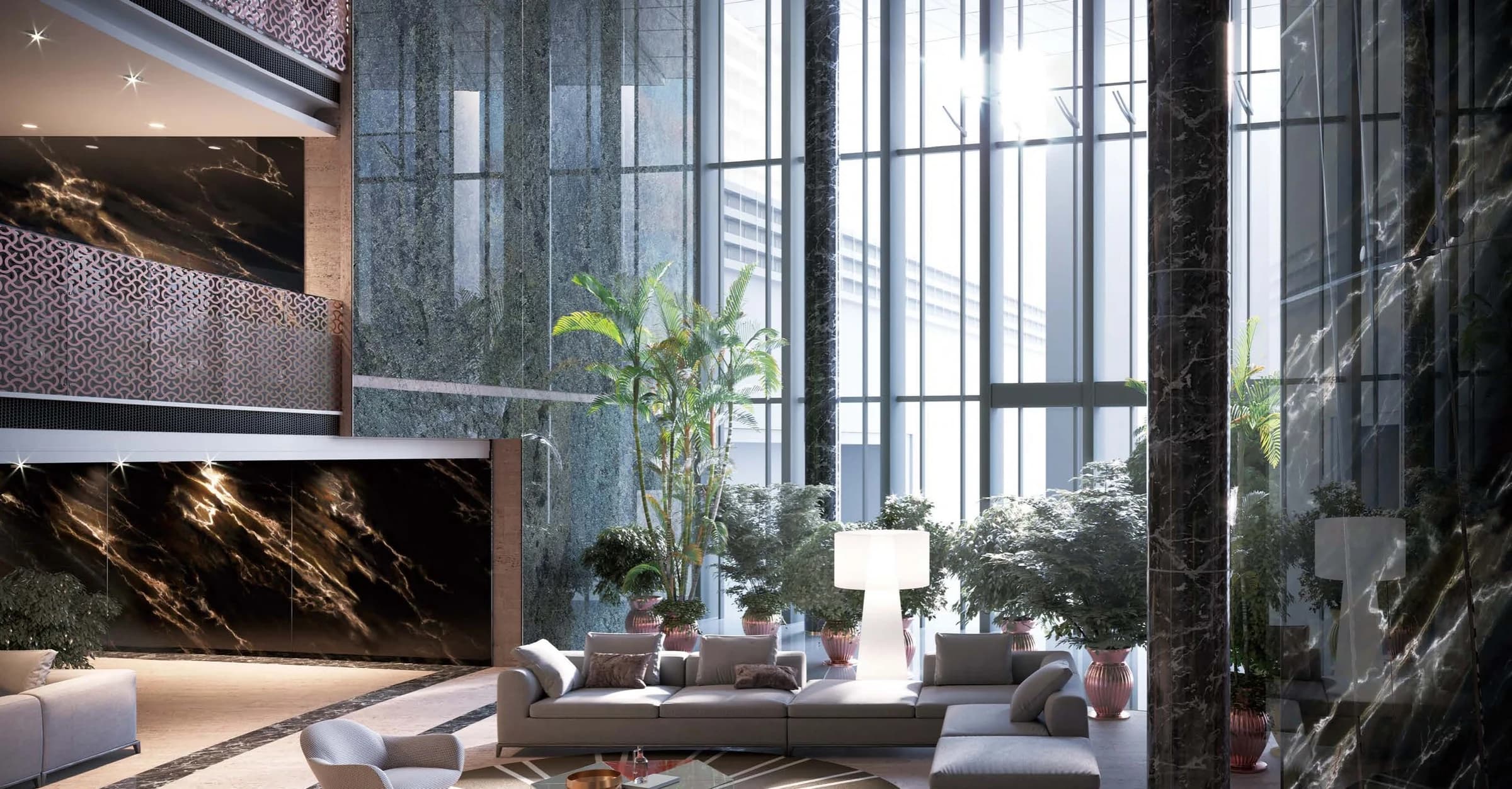
02 / Light
A colour is never seen in isolation from light. Look at a sample against a pale background, then against a darker one. View it near a window and under the lighting proposed for the room. Transparent, translucent and reflective directions offer different visual relationships with what lies behind and around them. The same composition may feel open from one position and more layered from another. These observations belong at the beginning of a material conversation, before an appearance is settled through a photograph alone.
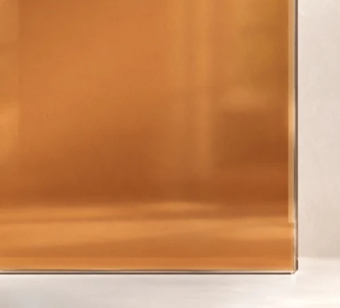
A closer colour perspective
03 / Dialogue
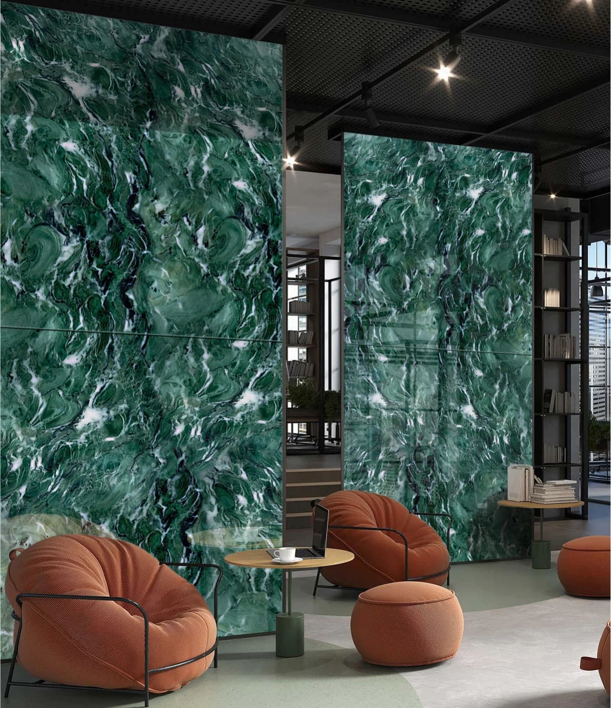
Mineral expression
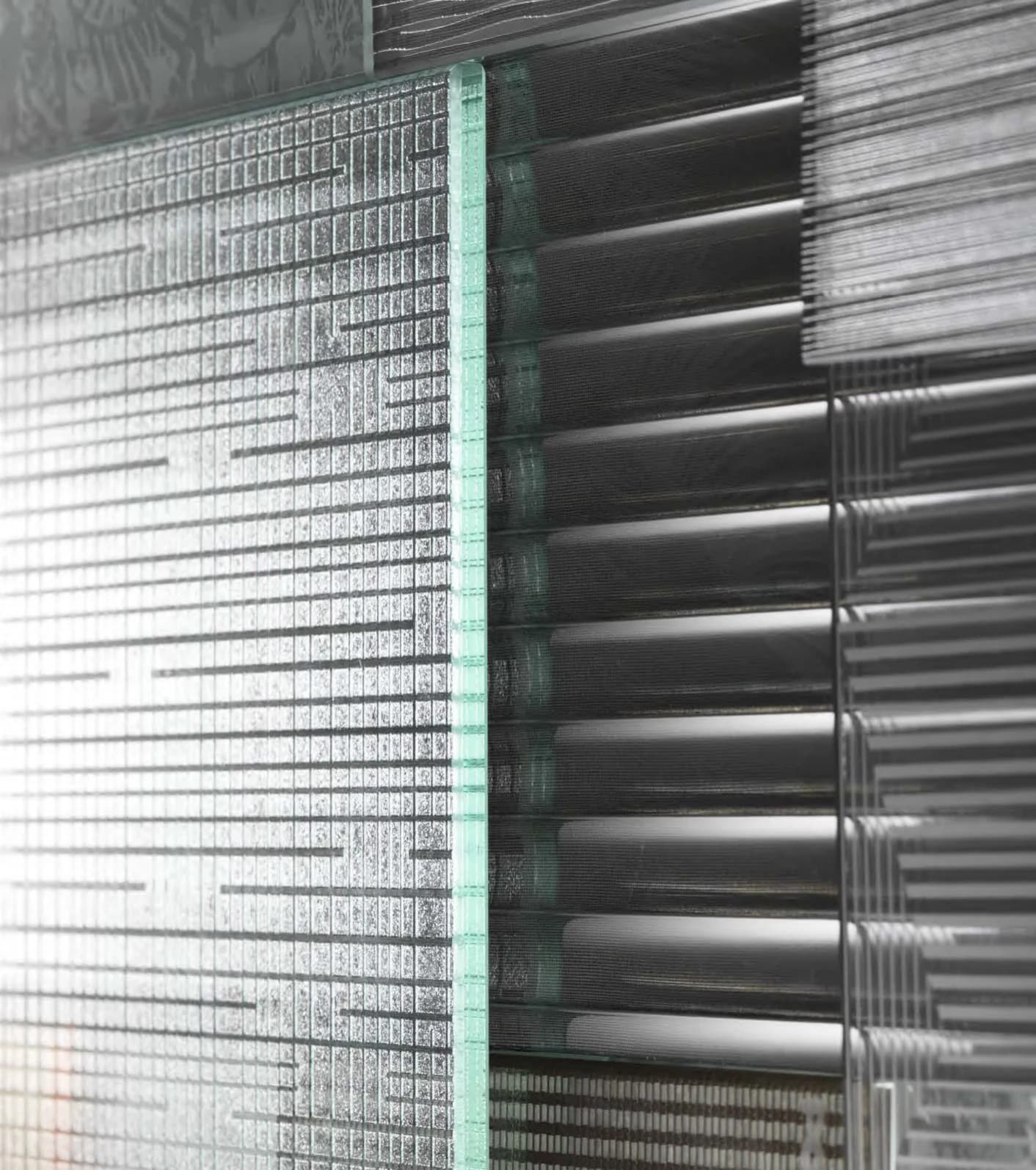
Glass / Surface / Detail
Glass rarely speaks alone. Beside wood, its precise edge meets grain and warmth. With stone, a reflective plane can sit against a quieter, more irregular surface. Metal introduces a fine line; fabric brings a softer rhythm. Rather than making every material compete, consider what each one contributes to the composition. Colour can connect these elements or mark a deliberate change between them. A material board becomes more useful when the pieces are seen together, with room for light and shadow to enter the arrangement.
A material composition
04 / In space
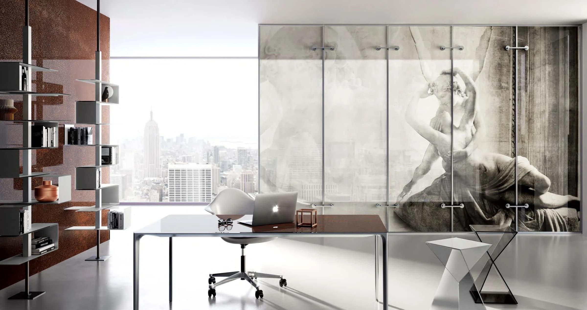
Move from the sample to the room. In a partition, colour may become part of a long view. In hospitality, it can help give an arrival sequence a particular atmosphere. At the scale of furniture, an edge, a joint and a nearby object become more noticeable. Each setting asks a different question of the material. Begin with the experience you want to create, then consider placement, proportion and the surrounding palette. The final choice is developed around the application, with the relevant material and specification confirmed for the project.
↗Customisation directions
Read colour through the surface as well as on it. Backgrounds, reflections and illumination affect how a sample appears; a photograph provides a direction, while a physical sample helps resolve the choice.
Bring adjacent material samples and a colour reference. Review the intended tone against both pale and dark backgrounds.
Compare the sample under the proposed lighting and at different viewing angles. Discuss the desired balance of reflection and visibility.
Share the intended panel arrangement, exposed edges and framing. Confirm the available finish and build-up around that application.
↗Project requirements
Dimensions, thickness, finishes, availability and supporting technical information are confirmed according to the intended application and project requirements.
↗Related collections
04 / Surface & depth
A surface that holds the light.
02 / A new perspective
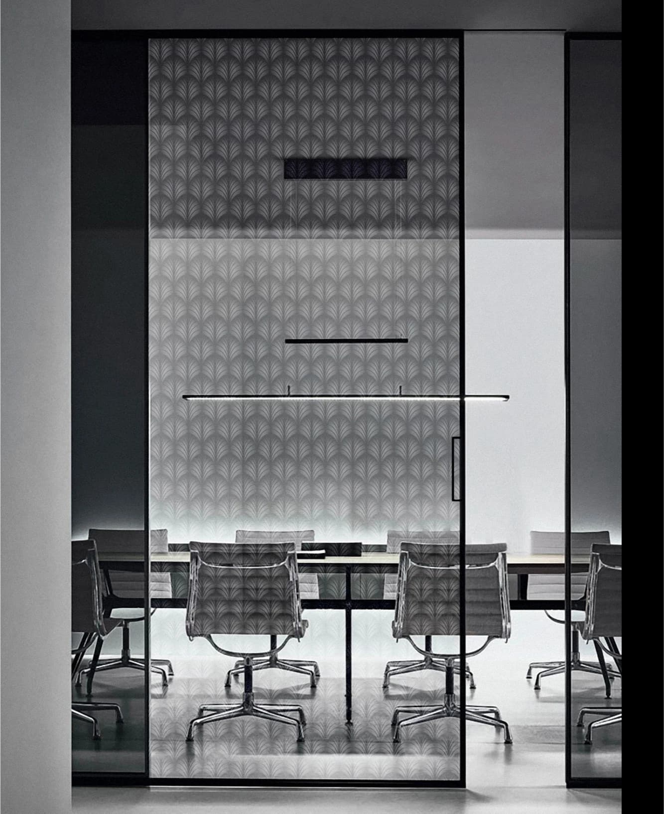
A new point of view.
↗Project references
Explore related visual ideas in selected POBO projects.
Let’s explore the possibilities
Let’s make it in glass.