01 / Colour & atmosphere
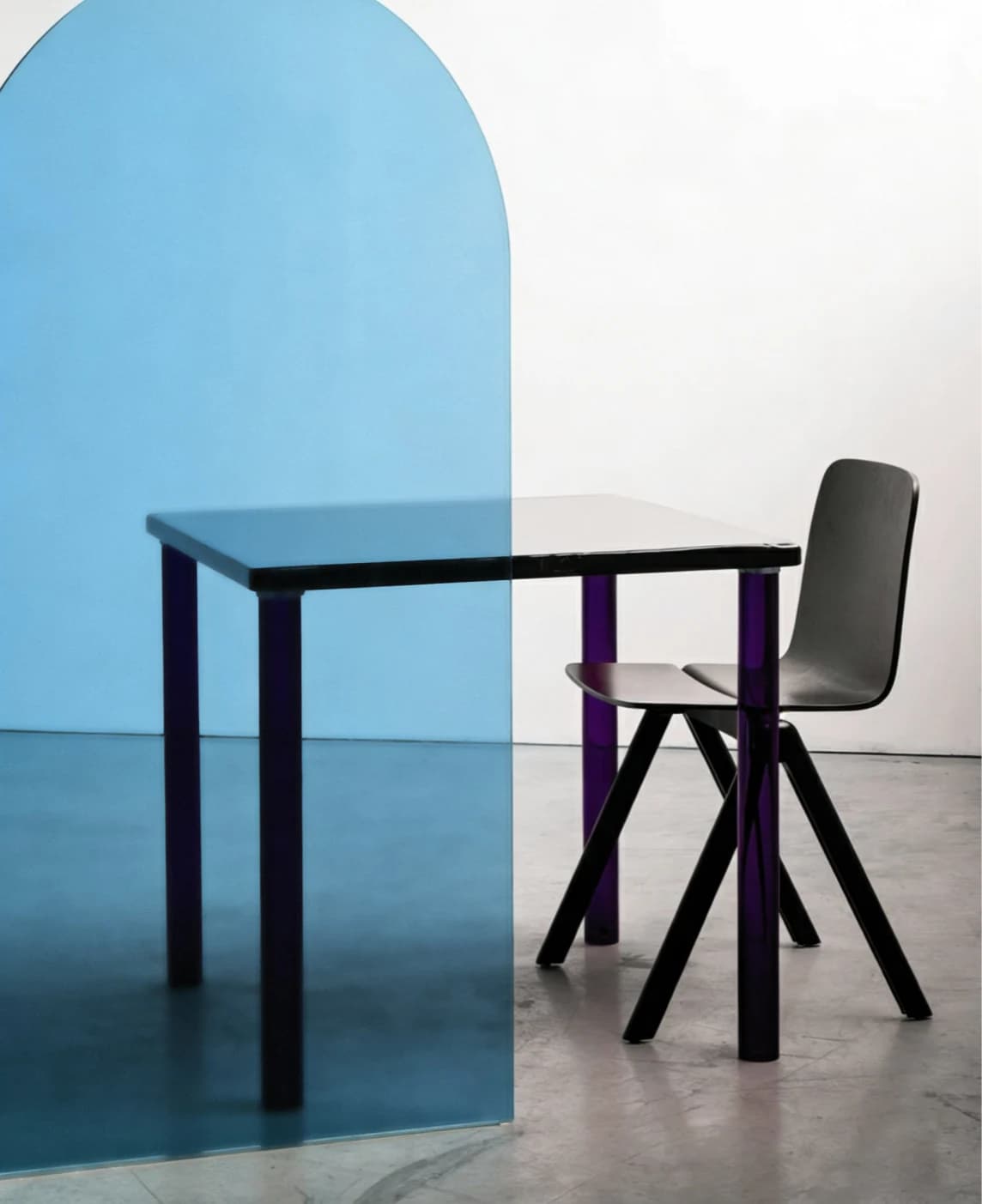
Color.
An atmosphere in every shade.
 Start a Project
Material & architectural perspectives
An atmosphere of arrival.
Hospitality interiors are read as a sequence: arrival, a place to pause, a route through the room and a closer view from a seat. Decorative glass can take a different role at each of these distances without repeating the same visual gesture everywhere.
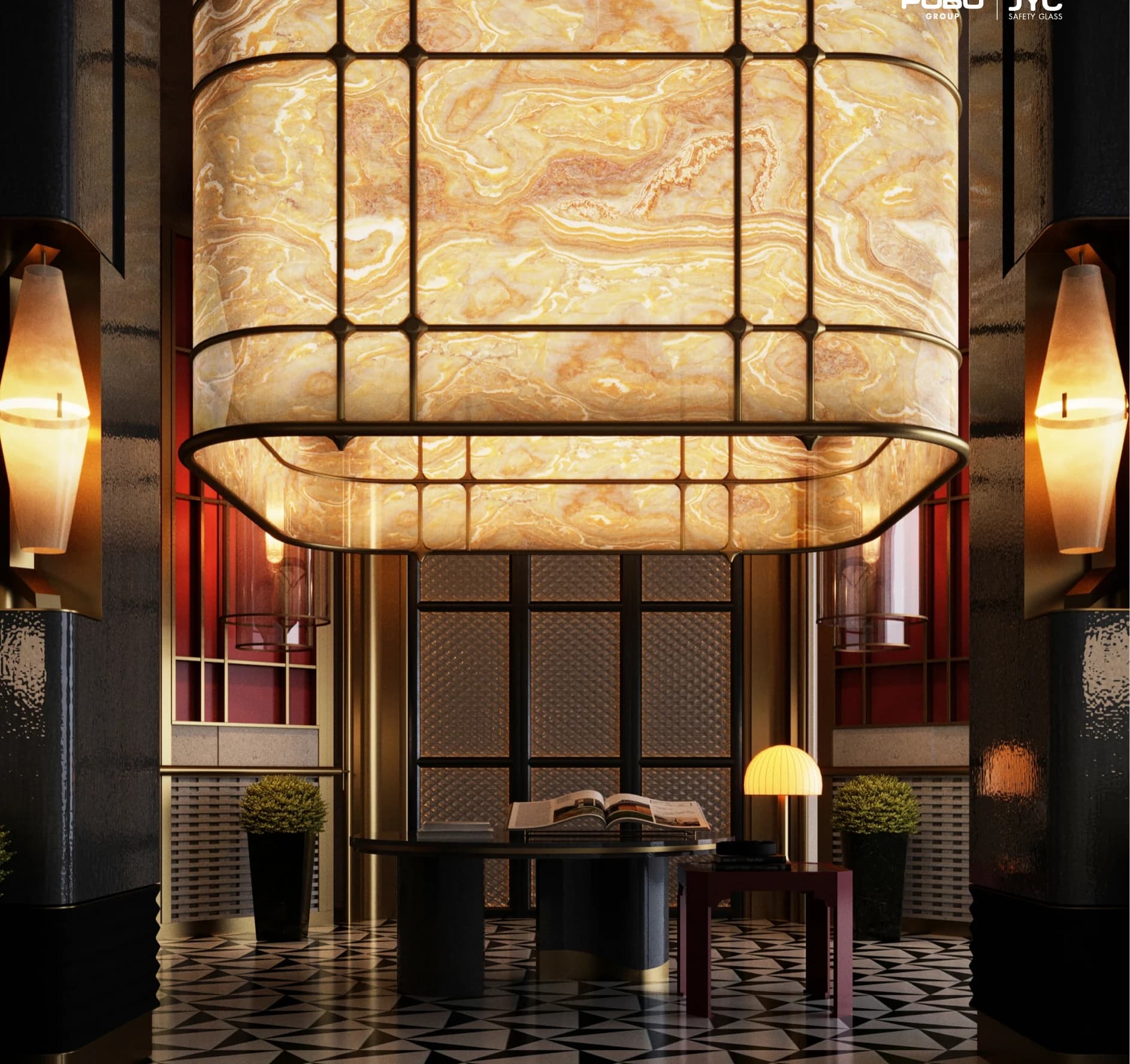
A surface can frame a table, mark a threshold or provide a backdrop to a shared space. Colour, pattern and reflection offer ways to connect these moments within a coherent material palette.
↗Related collections
01 / Colour & atmosphere
An atmosphere in every shade.
05 / A mineral expression
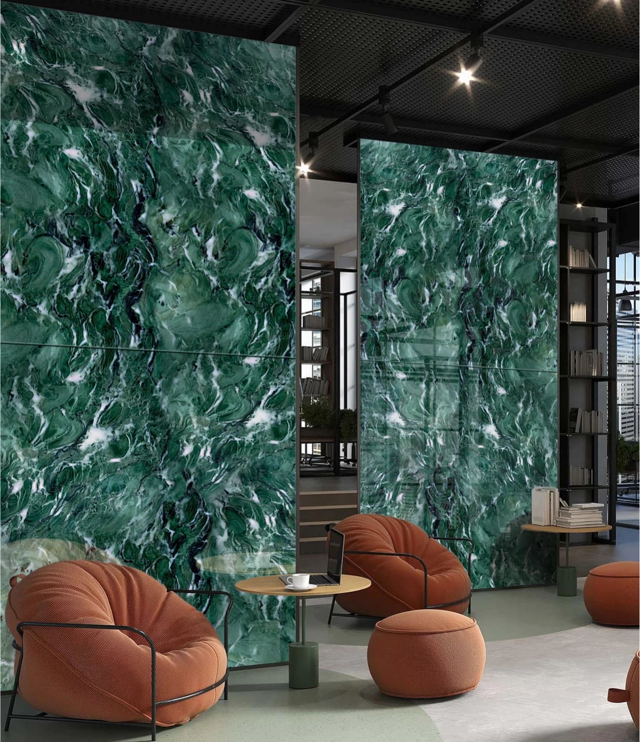
An impression of the natural.
02Application perspectives
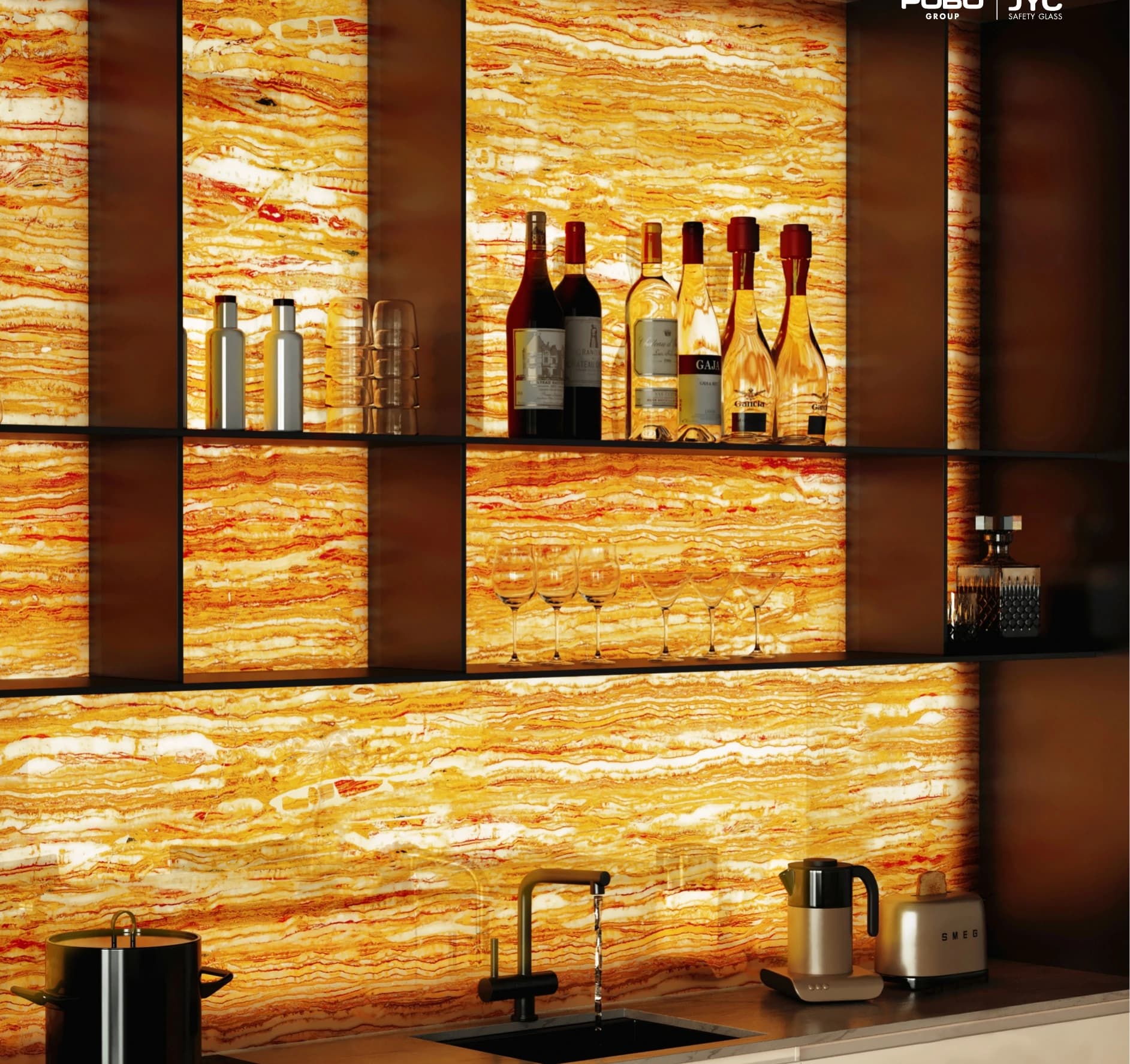
↗Design considerations
Color can establish a tonal accent, Texture can add a closer detail and Stone Effect can give a broader surface visual movement. Use samples to judge the relationship with fabric, timber and metal.
Identify the places that need emphasis and those that should stay quiet. Review the material from the approach and from a seated position.
Compare the sample under the intended lighting conditions. Reflections and the view beyond the glass may change substantially.
Discuss circulation, support, cleaning and maintenance needs alongside the visual brief. Confirm the specification for each application.
↗Project references
Explore related visual ideas in selected POBO projects.
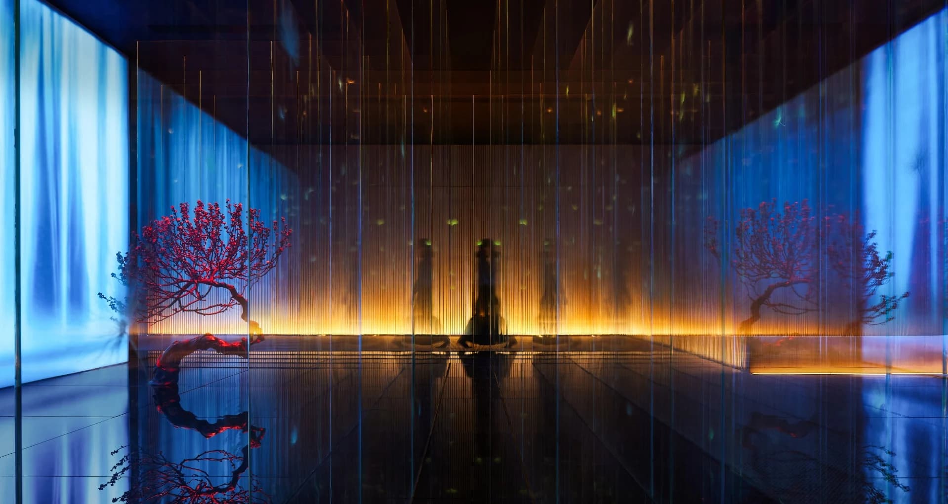
SELECTED PROJECT / Wellness
Blue and amber tones meet dark reflective planes, with decorative glass moving between atmospheric room views, intimate seating areas and layered enclosure details.
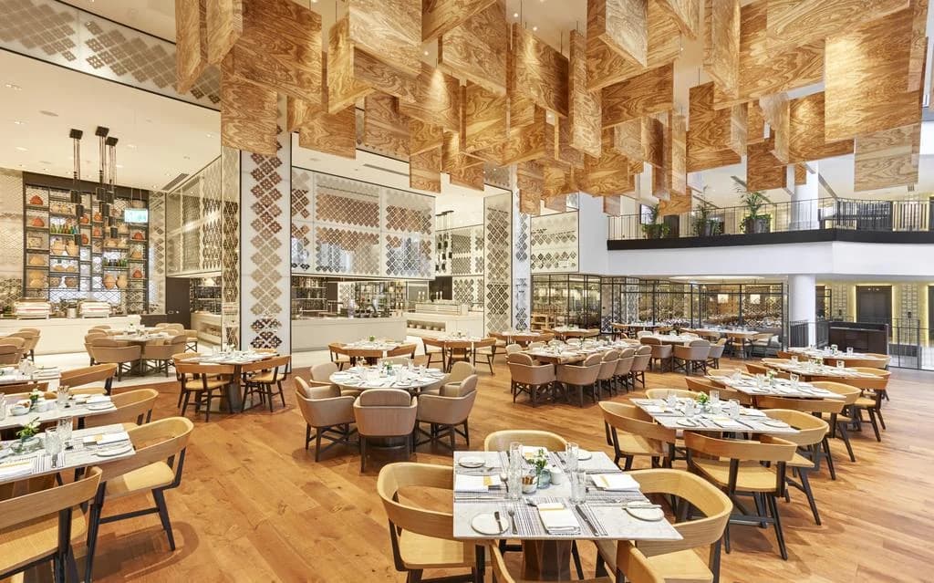
SELECTED PROJECT / Hospitality
Geometric glass surfaces bring a repeated rhythm to dining and counter settings, connecting close material details with warm furnishings and the larger forms overhead.
Let’s explore the possibilities
Let’s make it in glass.